1. Challenge
O IARA++ is a research and extension laboratory in Artificial Intelligence, Robotics and Algorithms, linked to Federal University of ABC Paulista (UFABC).
The challenge was to create a a visual identity that reflected the scientific and innovative spirit of the laboratory, translating academic rigor, mathematical precision and technological dynamism in contemporary and accessible language.
The brand should communicate both theoretical and investigative nature of research on the transformative potential of AI and robotics in society, balancing clarity, sophistication and visual innovation.
2. Solution
Wandenkolken Design has developed a visual identity based on mathematical aesthetics and the elegance of proportion, by combining typographic simplicity with symbolic concepts of order and progress.
Symbol and concept:
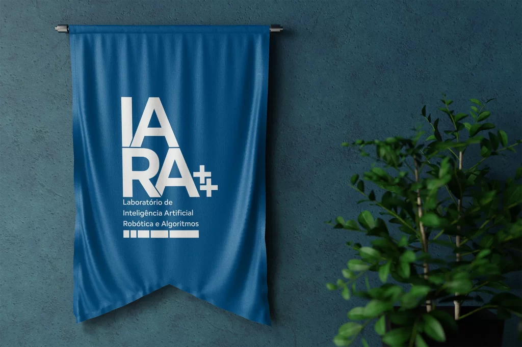
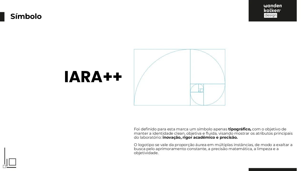
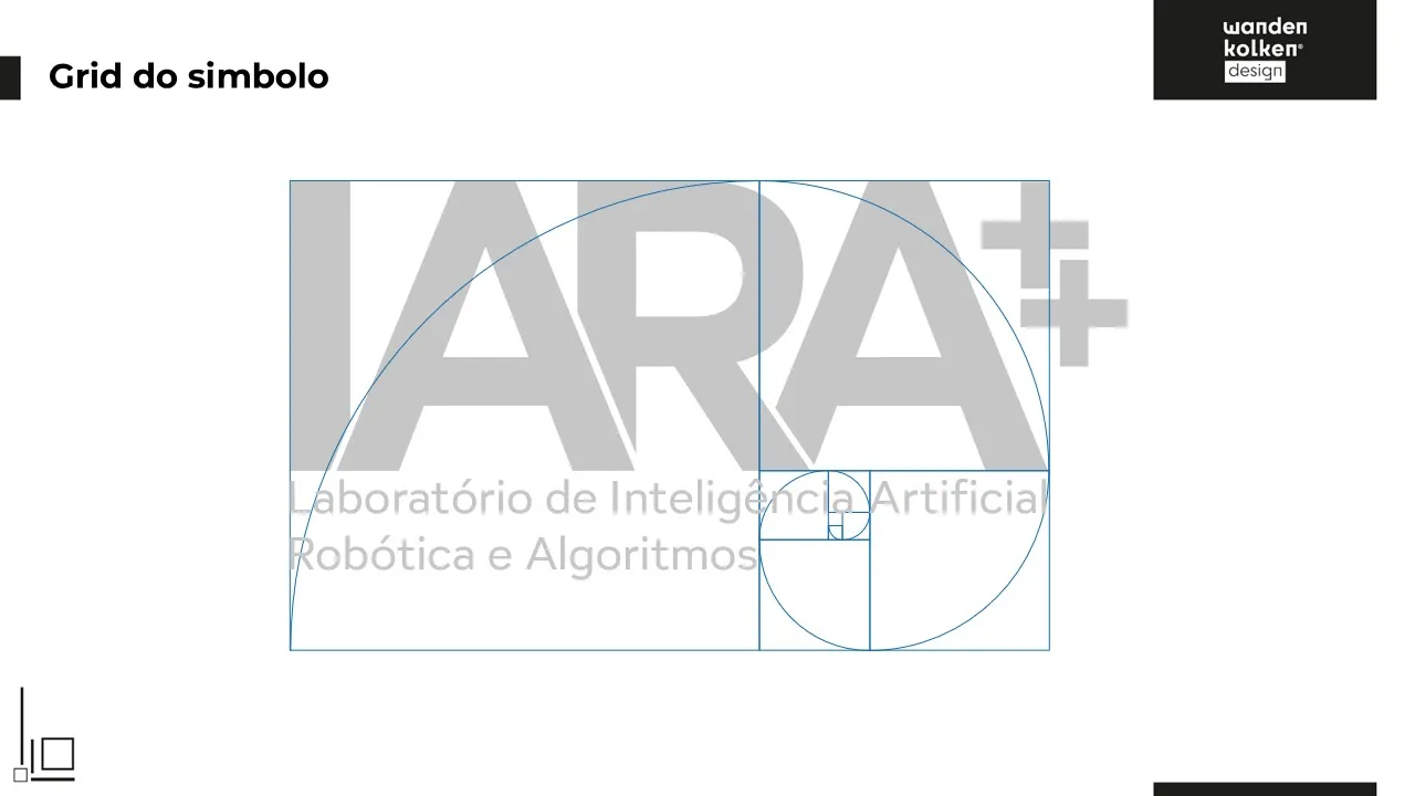
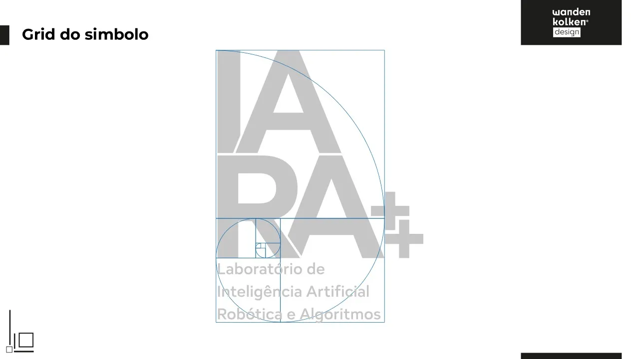
The logo was conceived as a pure typographic mark, without additional icons, in order to transmit clarity, precision and scientific neutrality.
The composition was built on golden ratio, applied in multiple instances, reinforcing the ideal of continuous improvement, rigor and balance - shared principles between design and scientific research.
The name “IARA++” is a direct reference to the programming logic, where the “++” operator stands for increase, evolution and constant improvement, The name itself becomes a manifesto of the laboratory's philosophy.Supporting graphics:
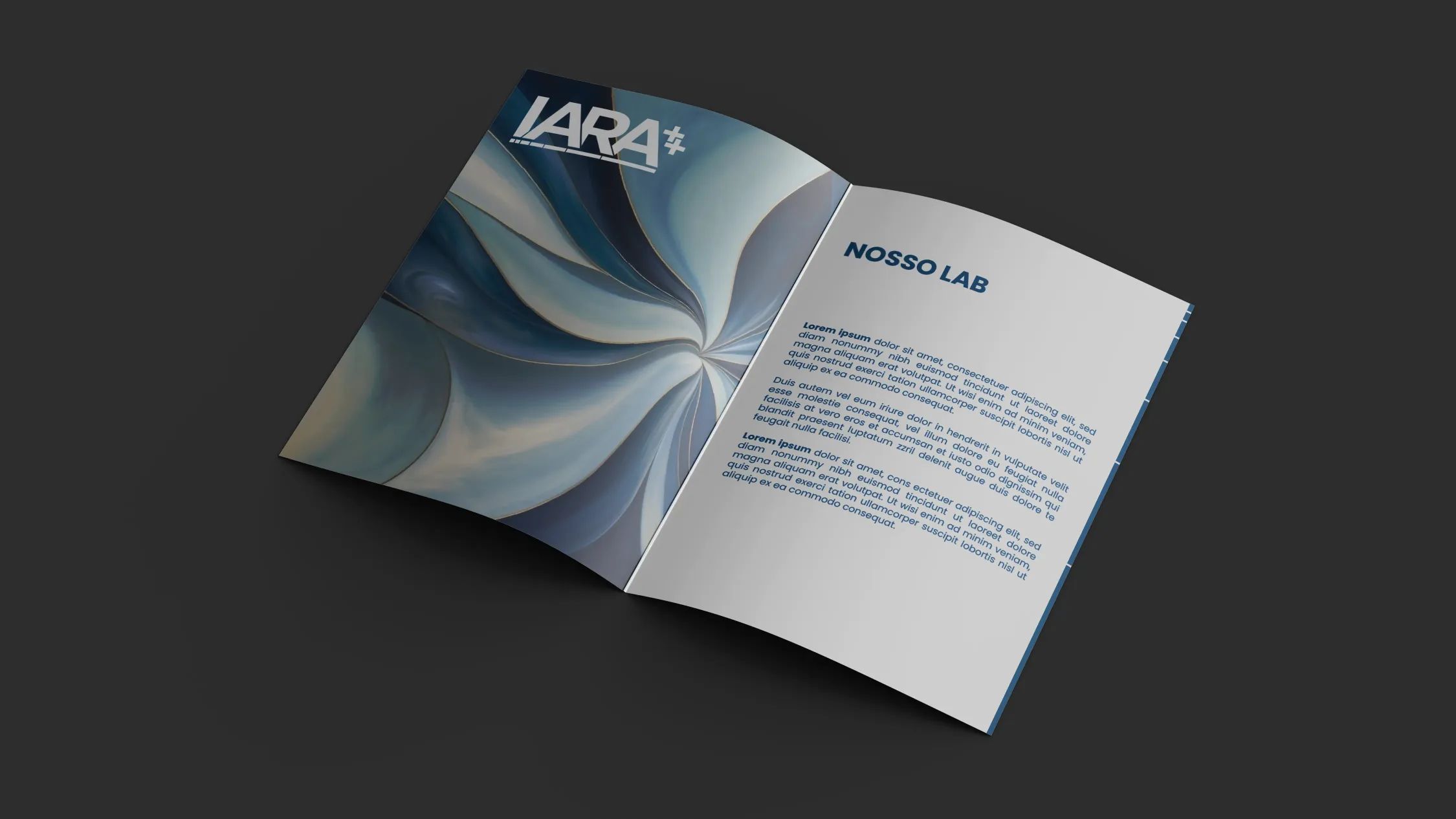
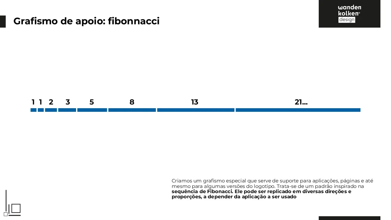
A visual pattern based on the Fibonacci sequence, used as a structural element in backgrounds, compositions and signature variations.
These graphics connect aesthetic reasoning to the world of applied mathematics, serving as a metaphor for the progressive development of knowledge.Images and visual language:
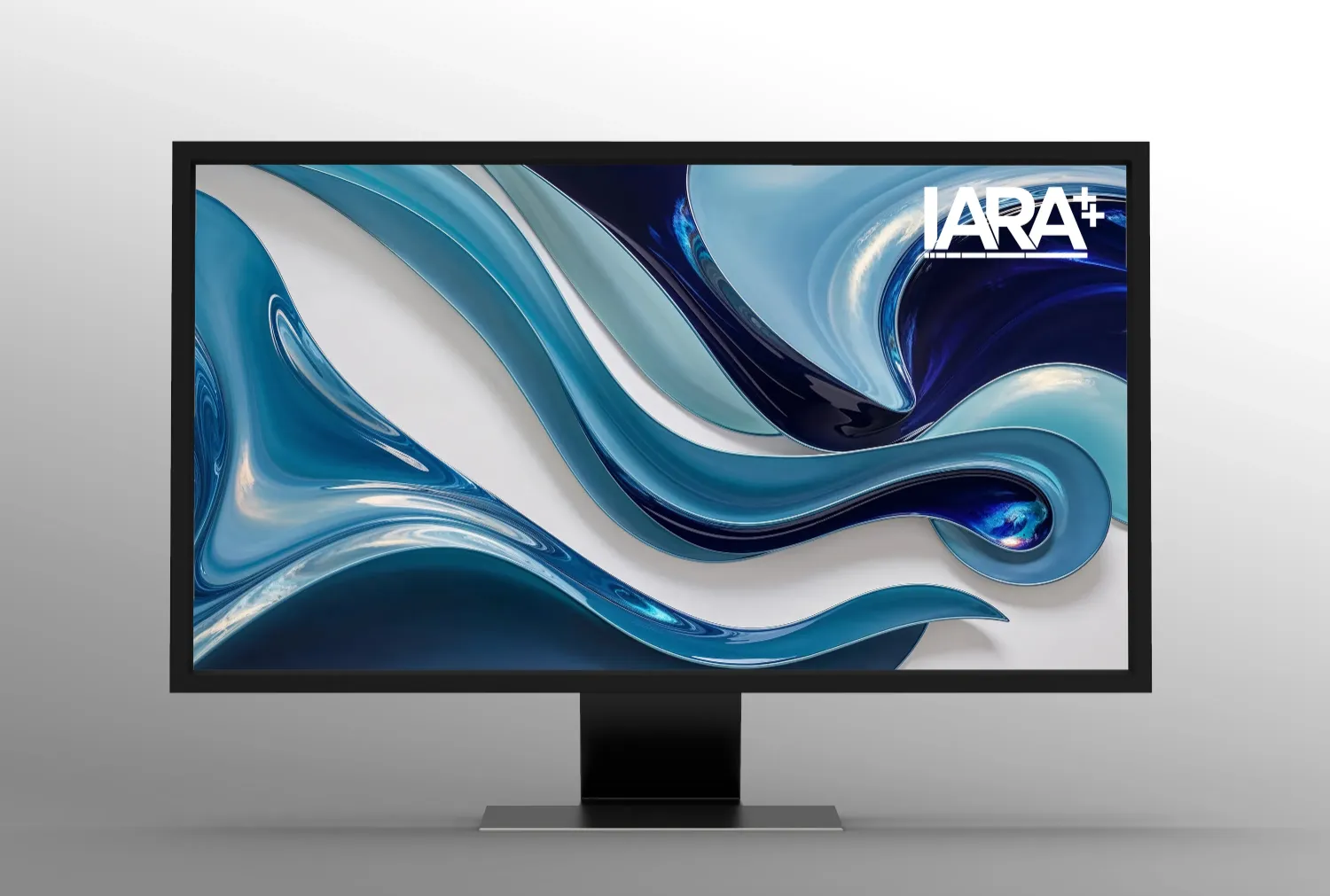
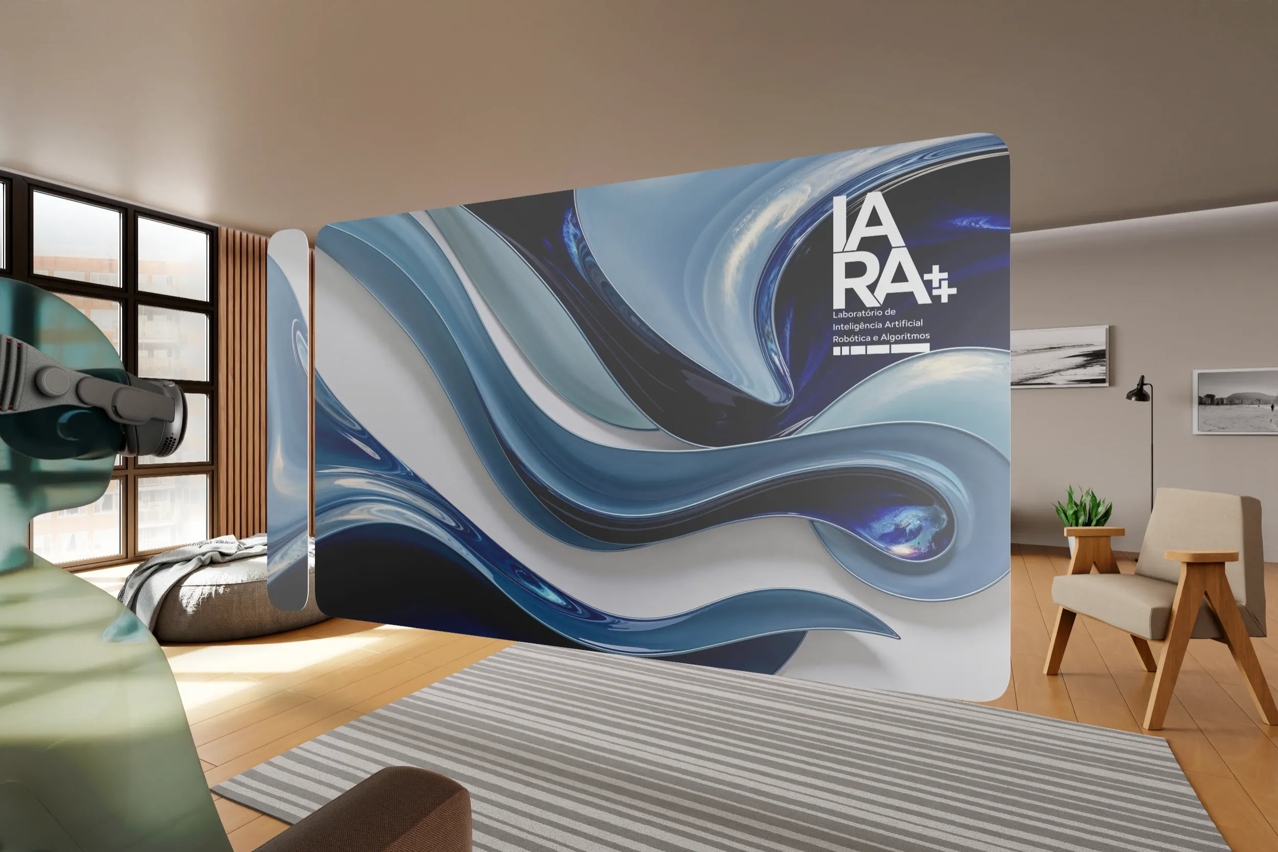
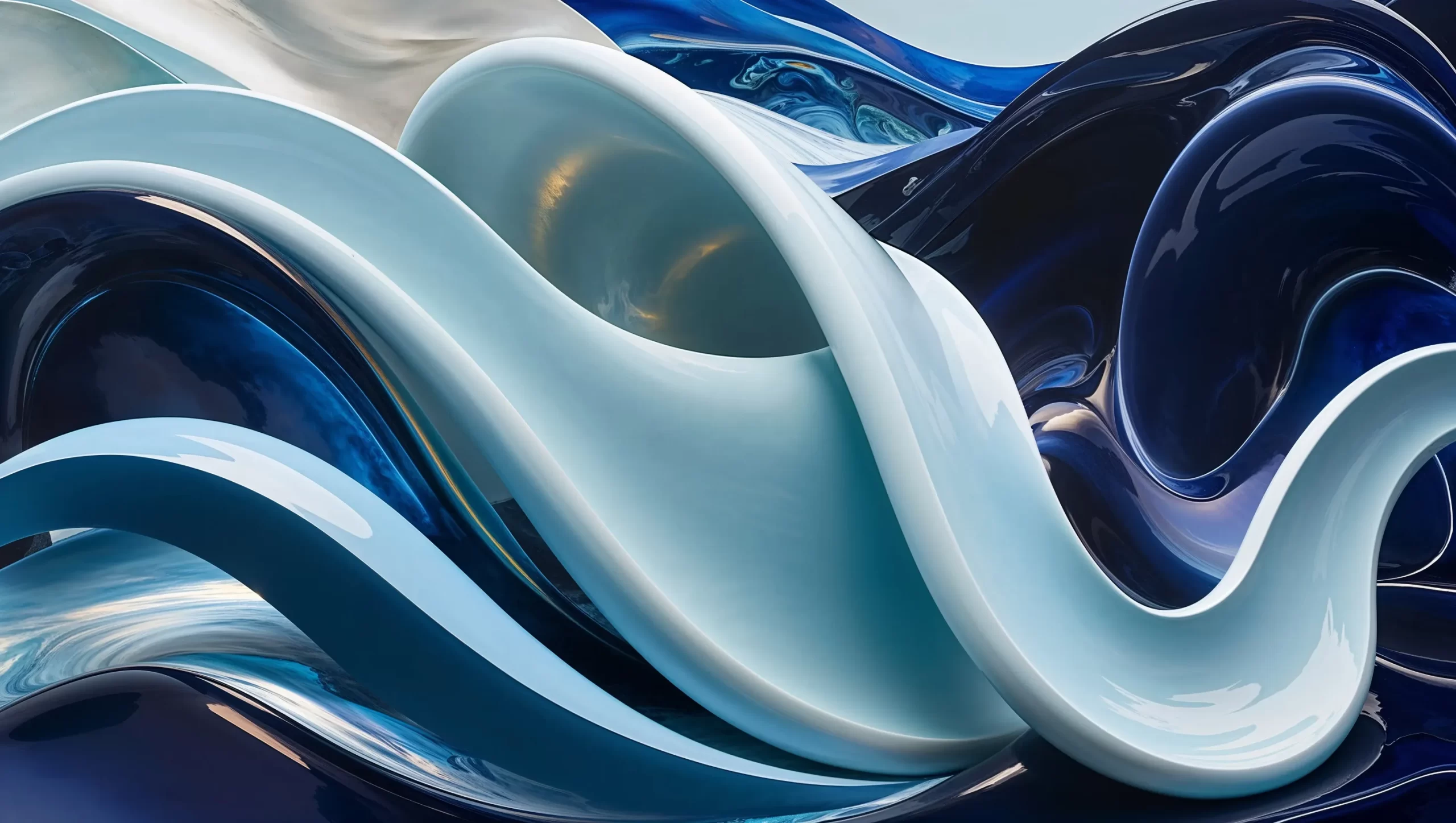
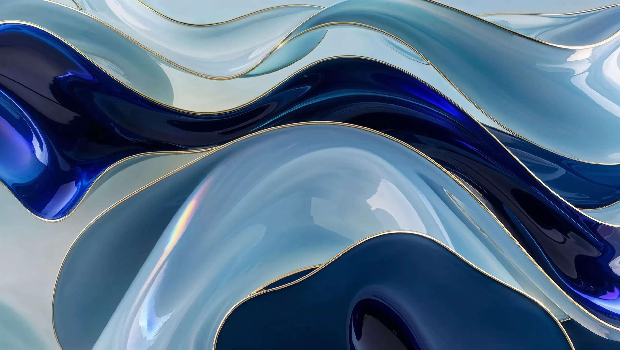
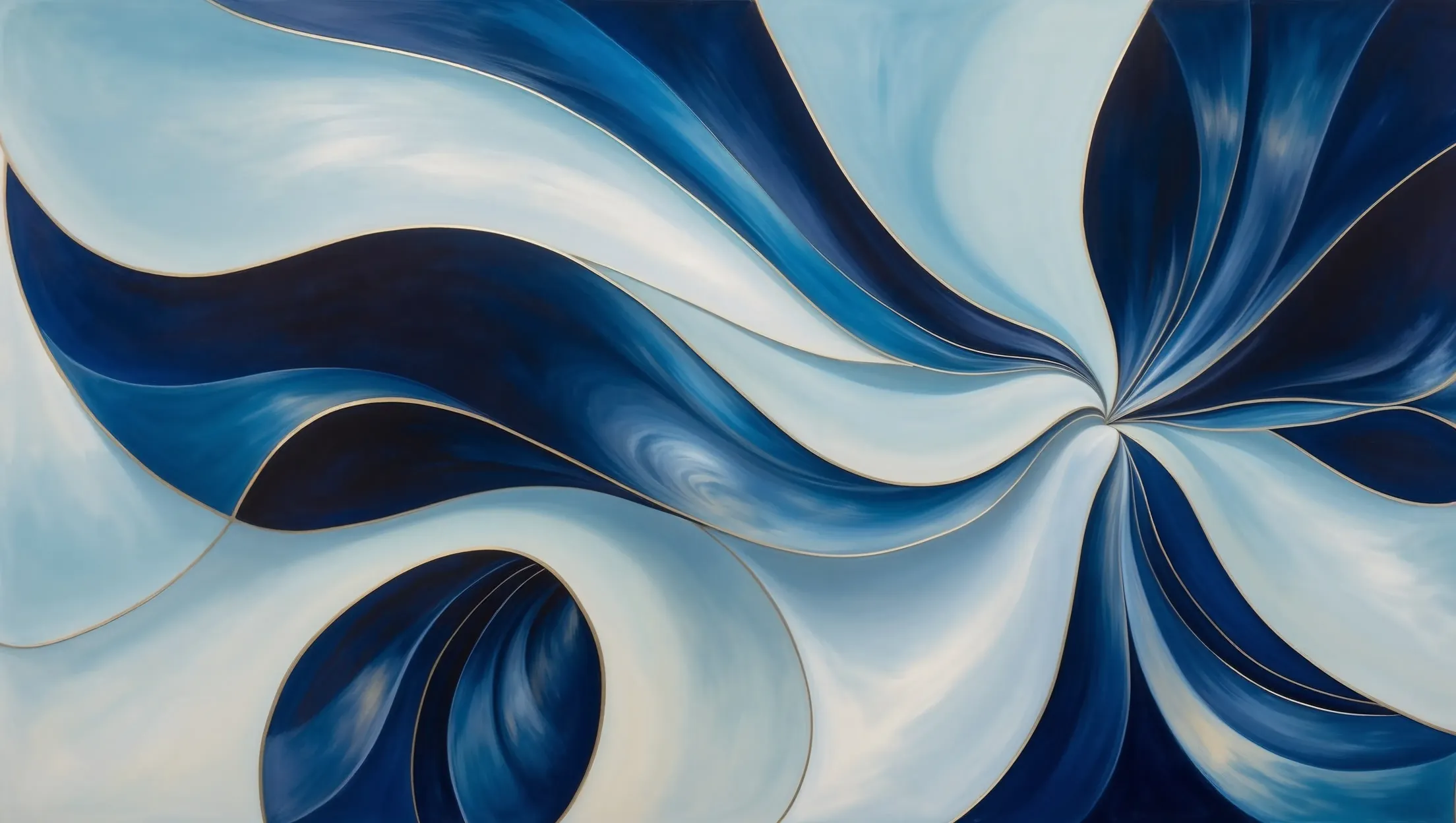
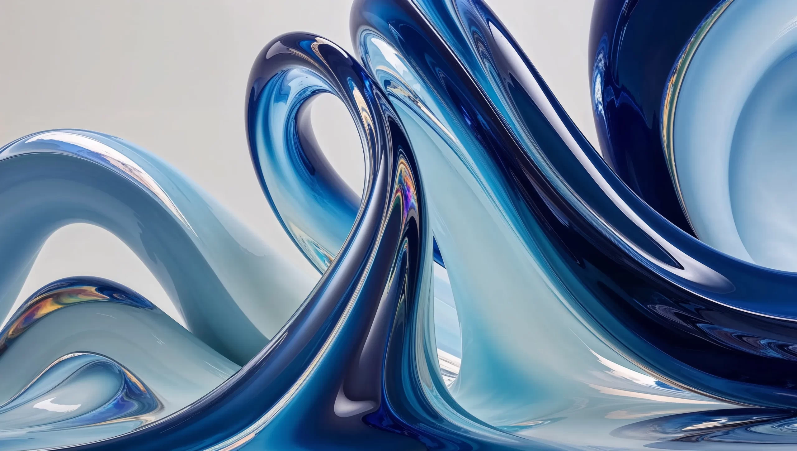
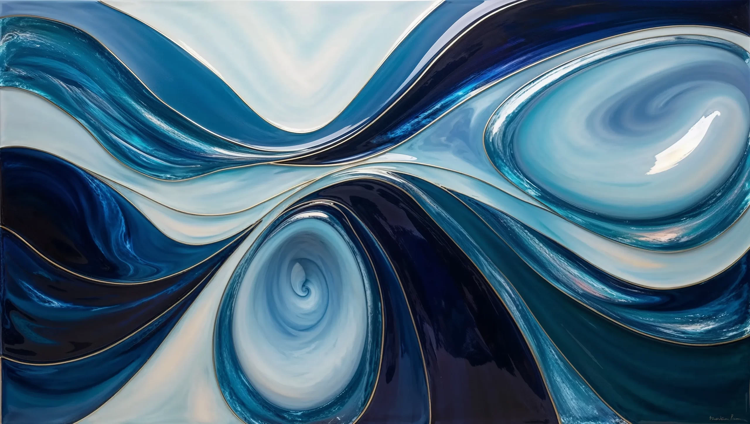
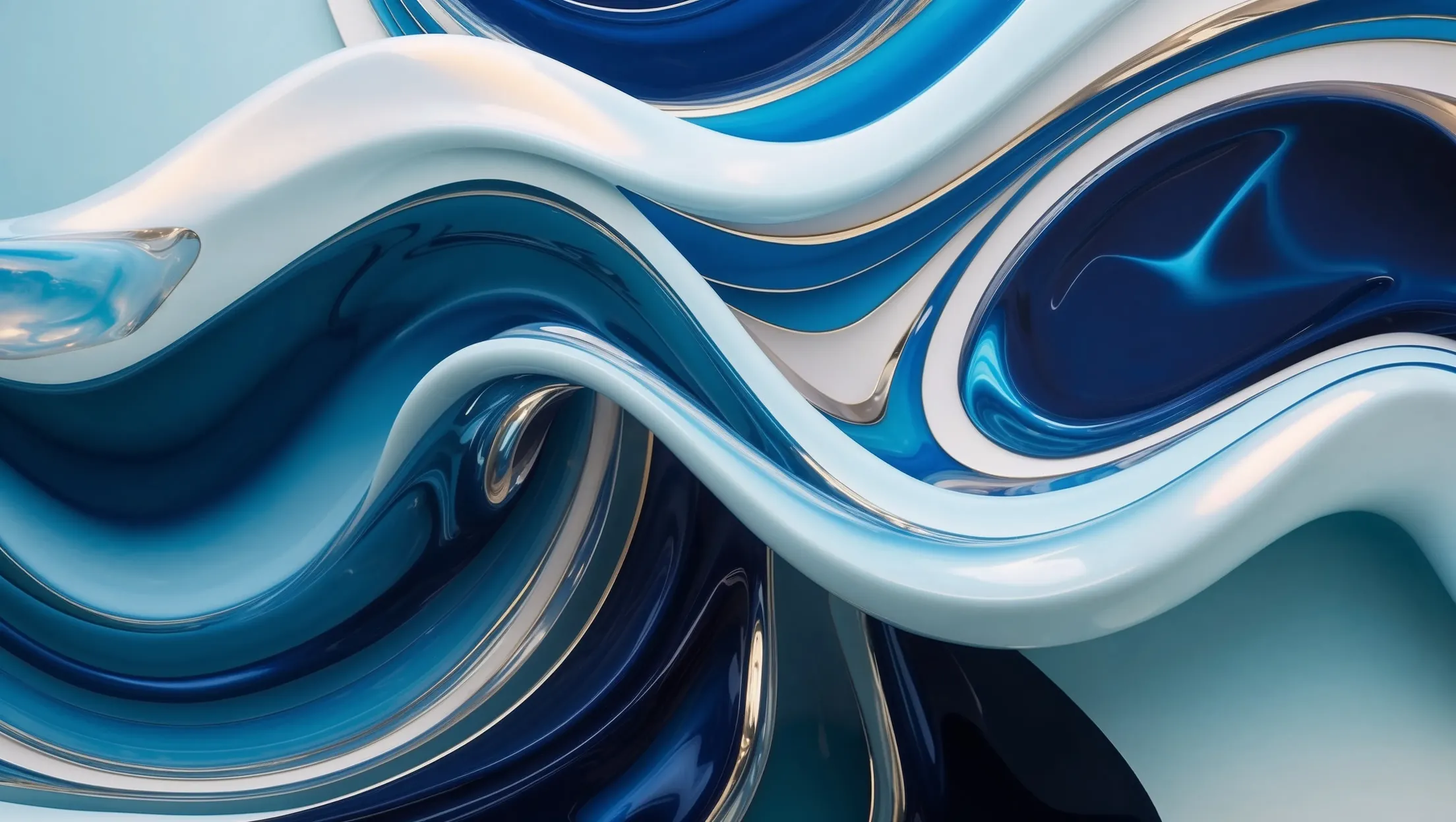
The following were developed two groups of conceptual images generated with AI (Stable Diffusion):Abstract, They are inspired by fractals, golden spirals and natural growth patterns, evoking the fluidity and experimental nature of scientific research.
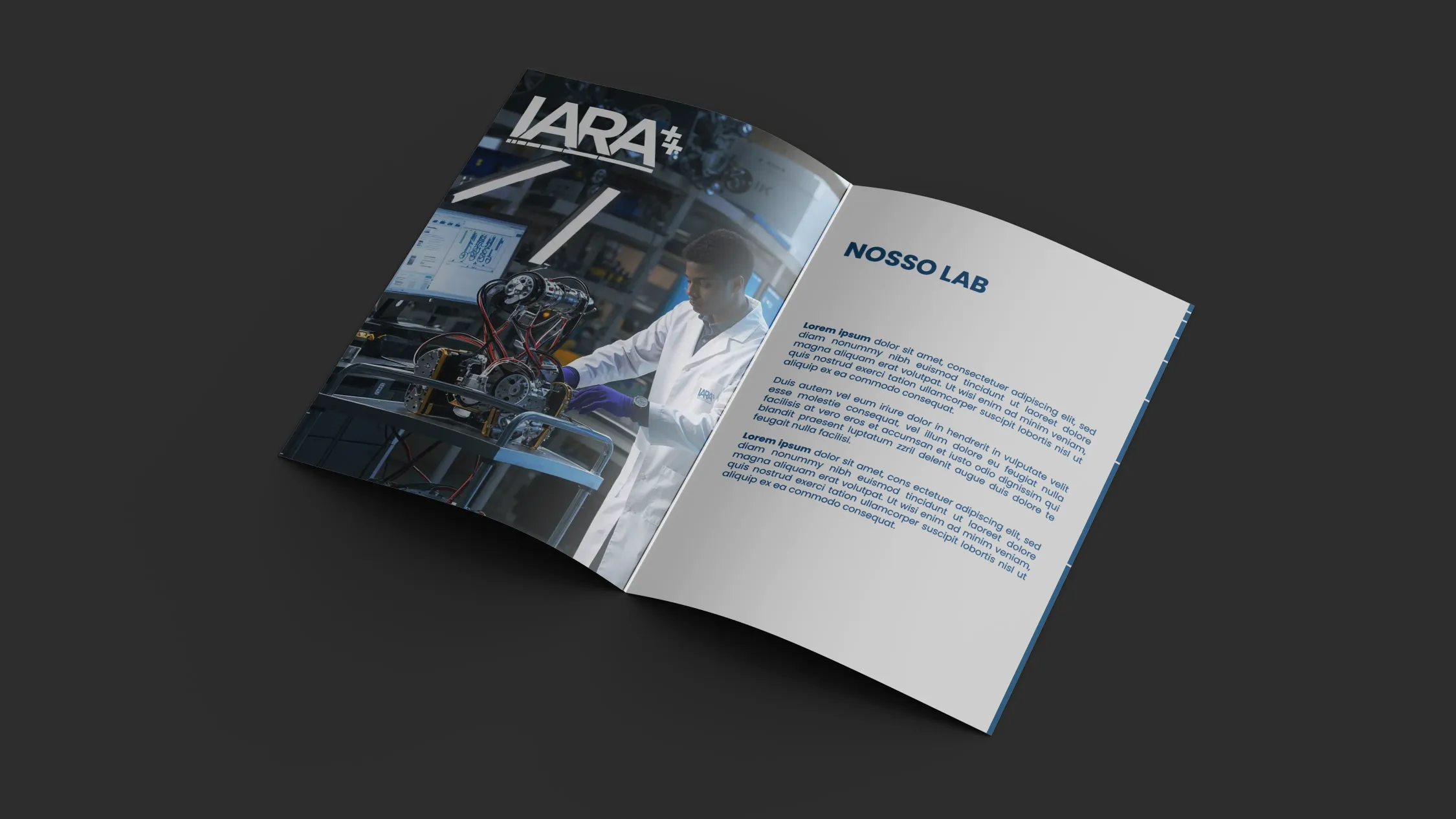
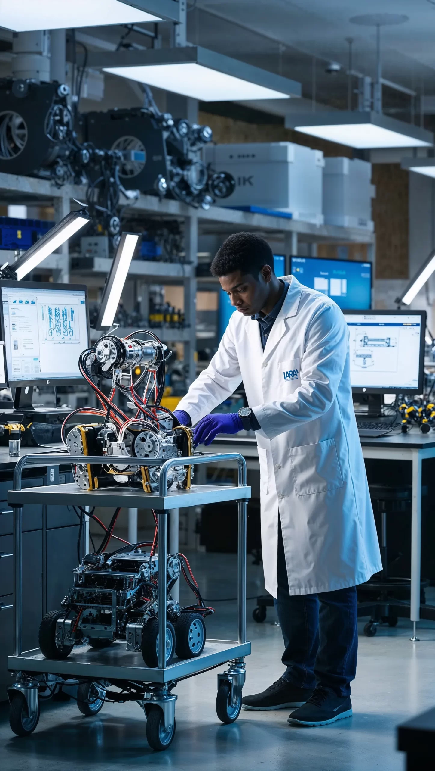
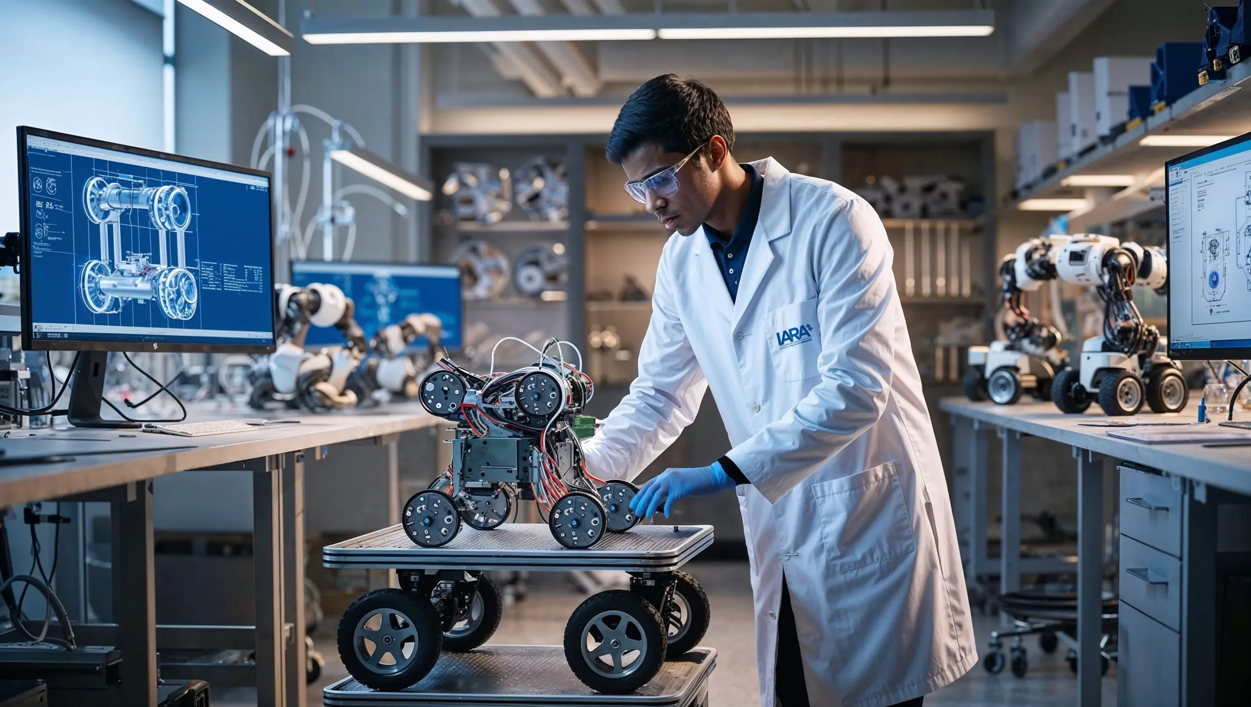
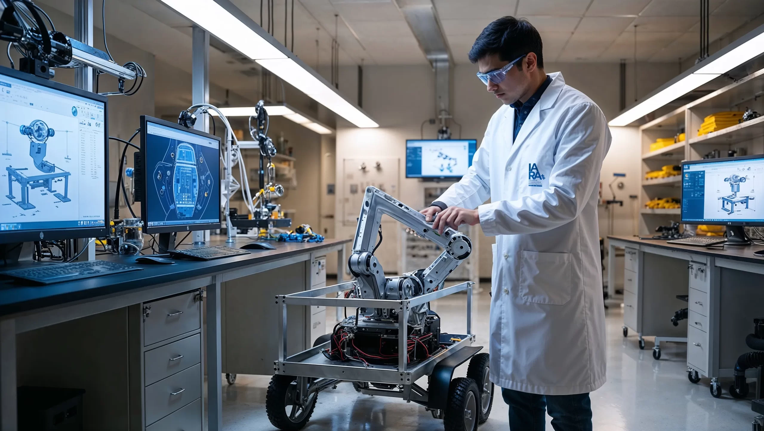
Institutional, with realistic representations of laboratory environments and technology, which reinforce the brand's academic seriousness.
The images created with generative artificial intelligence complement the brand's discourse, demonstrating in practice the use of the very technology that the laboratory studies and develops.
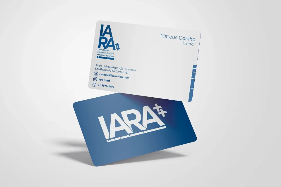
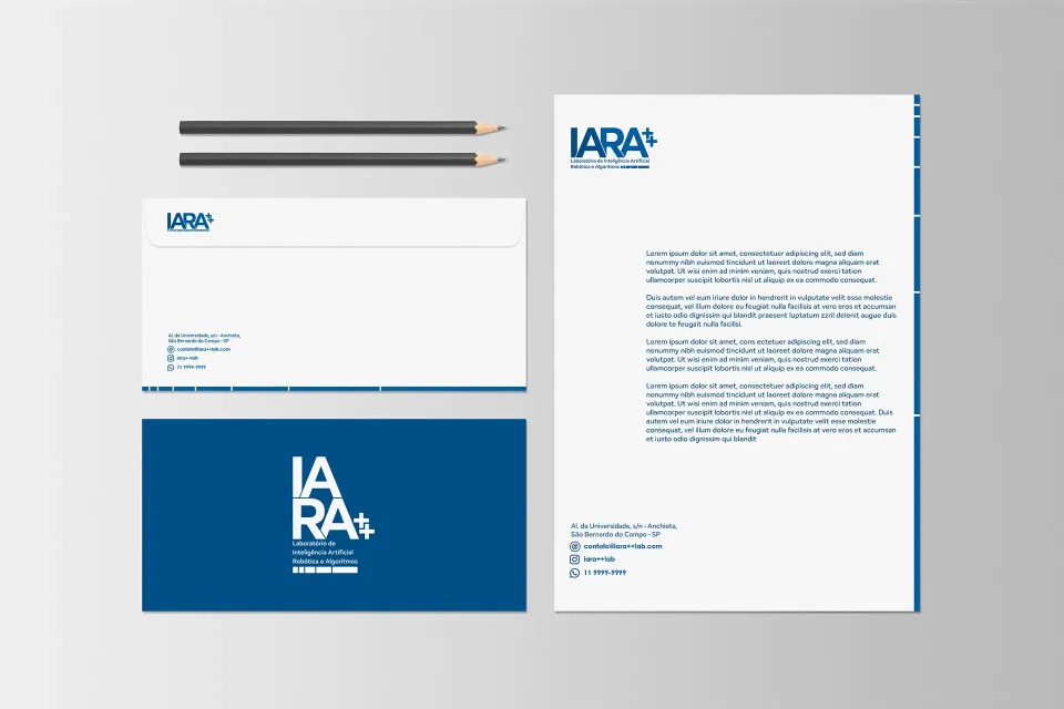
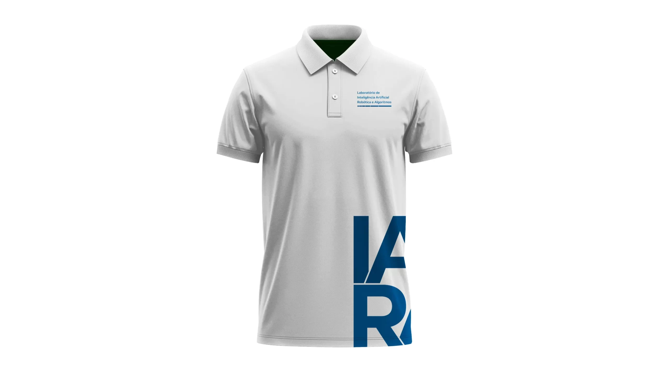
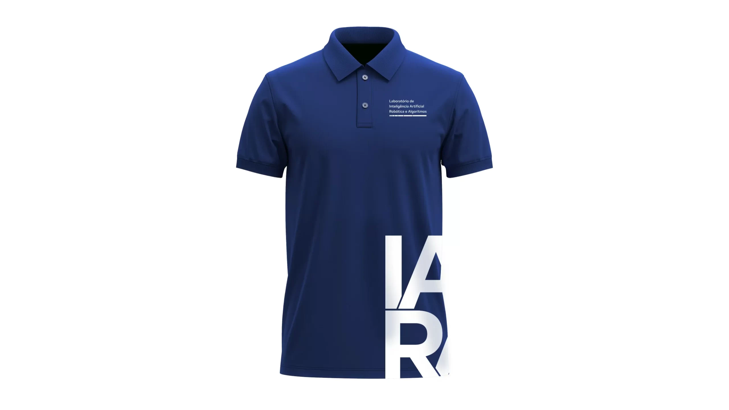
Typography and colors:
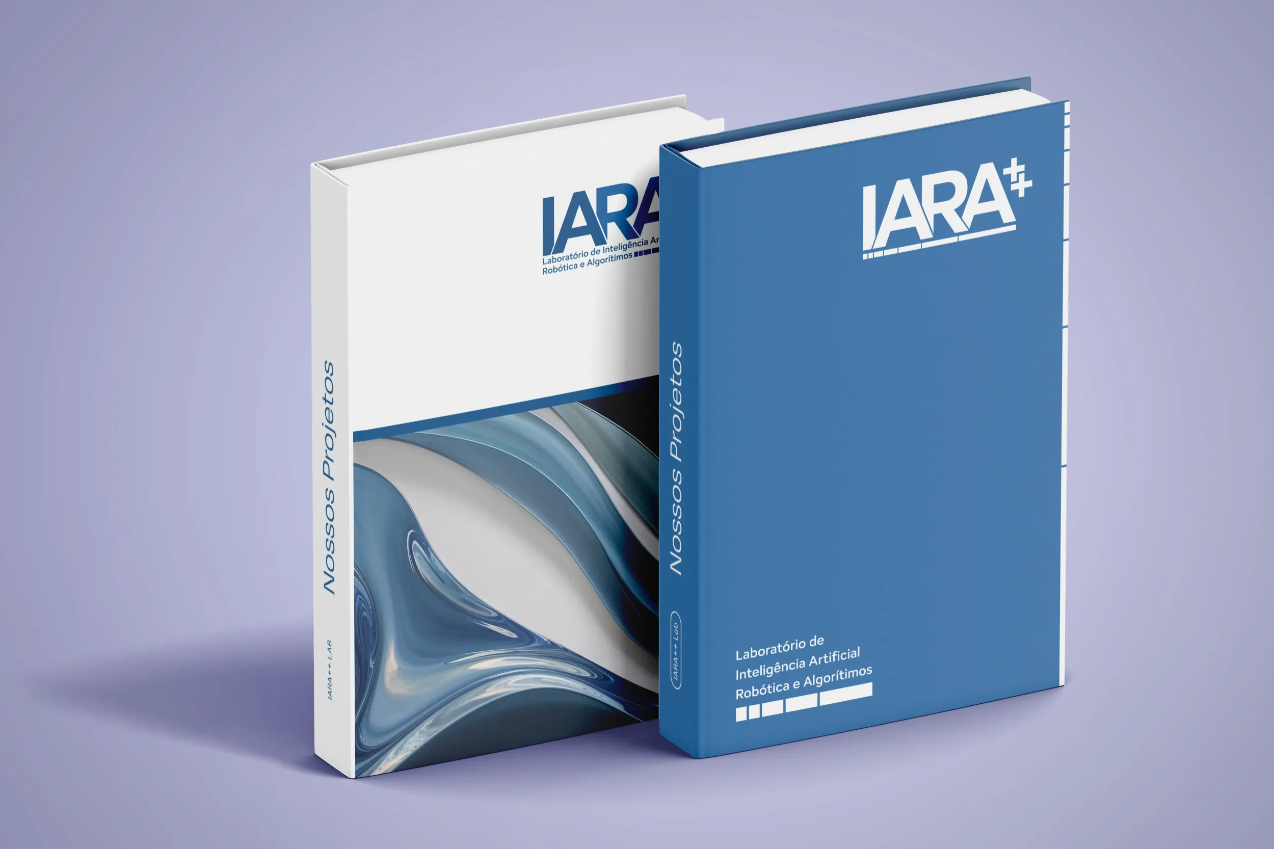
The typography was chosen by readability and geometric structure, while the color palette favors technological and scientific tones - blue and gray - balancing analytical coolness and institutional clarity.
3. Results
The project resulted in a visual identity sophisticated, precise and conceptually sound, able to translate the intersection between science, aesthetics and technology that defines the laboratory's work IARA++.
The new brand has consolidated itself as a symbolic representation of the integrating logic and art, reflecting the academic rigor and experimental thinking that drives research in artificial intelligence and robotics.
The visual system - built on mathematical principles, the golden ratio and generative language - reinforced IARA++'s position as a cutting-edge innovation center within UFABC, It has also become an example of how design can express scientific values with clarity and sensitivity.
“André's work is surprising and modern. When I needed a visual identity that well represented our values in research, I didn't hesitate to look for this professional, and I wasn't disappointed. Needless to say, the work was excellent. However, even with high expectations, the care and attention to detail never fails to positively surprise. Even in the smallest details, you can see the presence of elements from the world of computing and exact sciences, and their fusion with artistic elements to generate a semiotic representation that guides us on a daily basis. The IARA++ laboratory is a visual representation of the excellence we want to show in our research.”
- Mateus Coelho Silva, Coordinator of the IARA++ Laboratory - UFABC
The brand thus became, a mirror of the laboratory's own missionto unite science and creativity to build the future - with precision, meaning and visual purpose.