1.Challenge
O Conecta Business Partners was born with the proposal to be more than a networking group - a community of entrepreneurs and friends united by the exchange of experiences, ideas and opportunities.
The challenge was to create a visual identity that expresses this collaborative spirit, communicating connection, trust and co-authorship.
As well as representing the group visually, the brand needed to translate a purpose: connecting people and businesses, communicating ideas and sharing reflections, all in a light, professional and inspiring way.
2.Solution
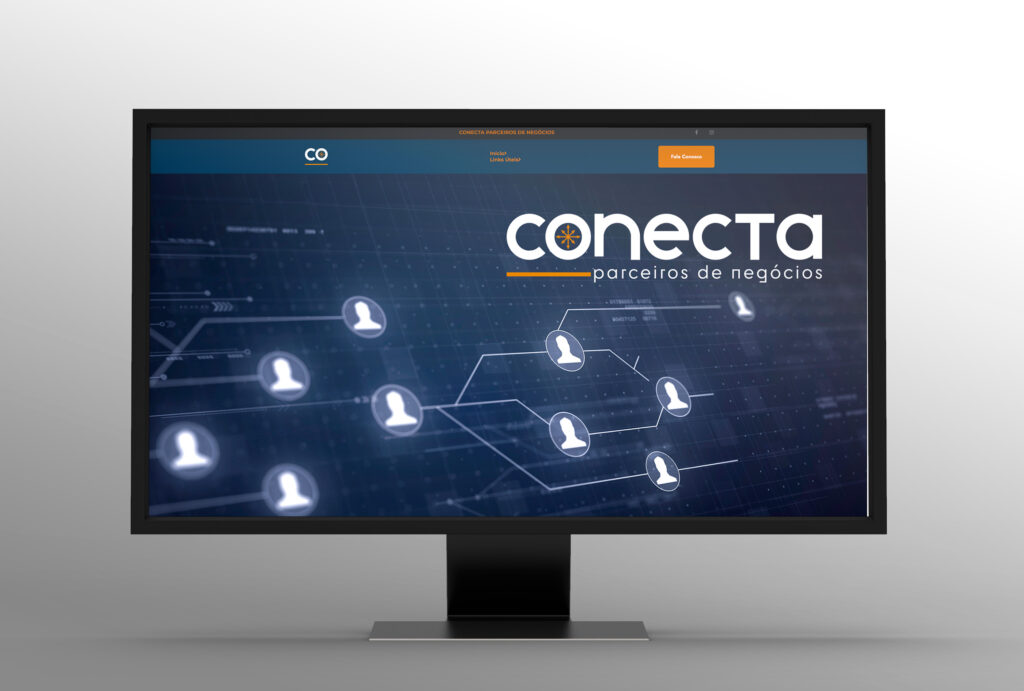
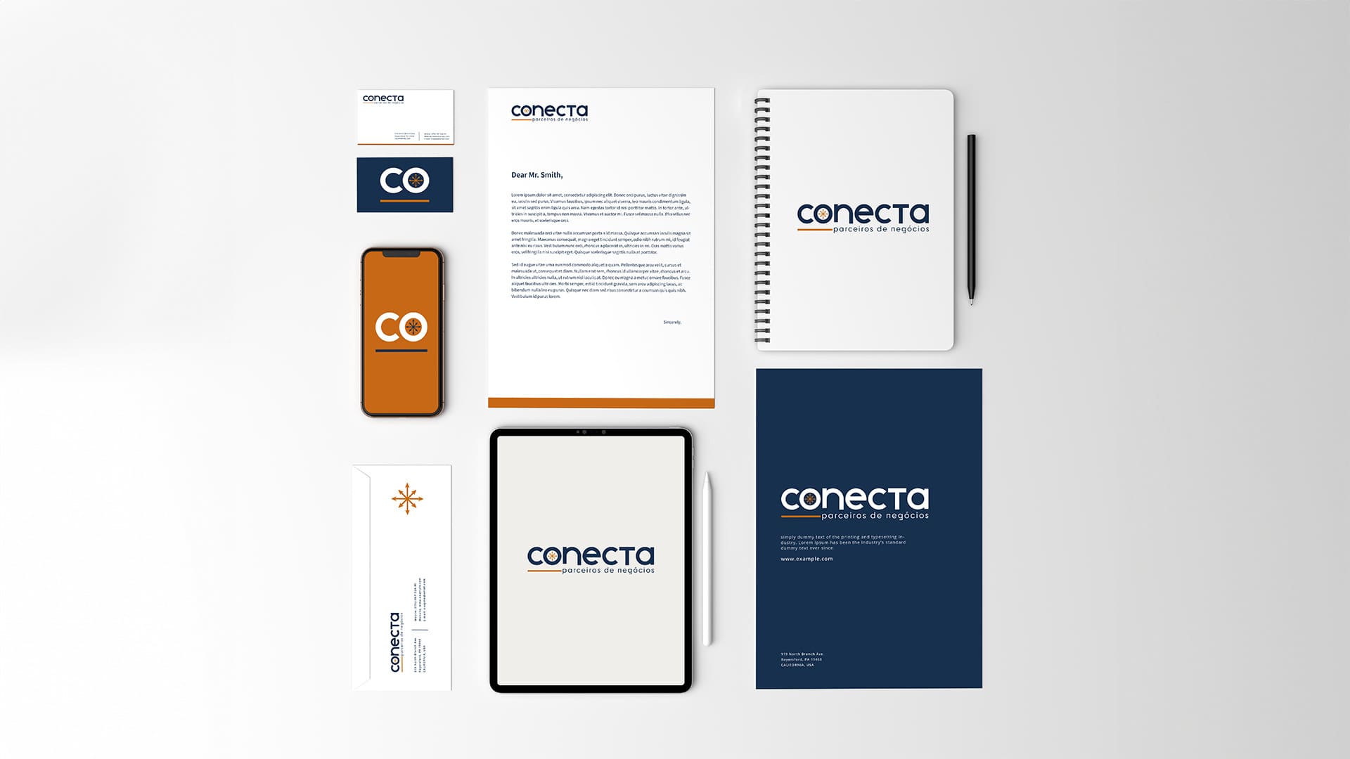
Wandenkolken Design has developed a visual identity conceptual and symbolic, inspired by the idea of compass - an element that orients, guides and helps to find paths, reflecting the role of the group as a north for entrepreneurs.
-
Symbol and concept: The logo was built using shapes that refer to the compass and direction, symbolizing the movement of connection and common purpose. Each point represents a participant, and the intersecting lines reinforce the concept of collaborative network.
-
Color palette: Sober and contrasting tones were chosen to balance out professionalism and proximity, transmitting energy and credibility.
-
Typography: Modern, with clean, confident lines, reinforcing the position of an organized, contemporary group committed to collective growth.
-
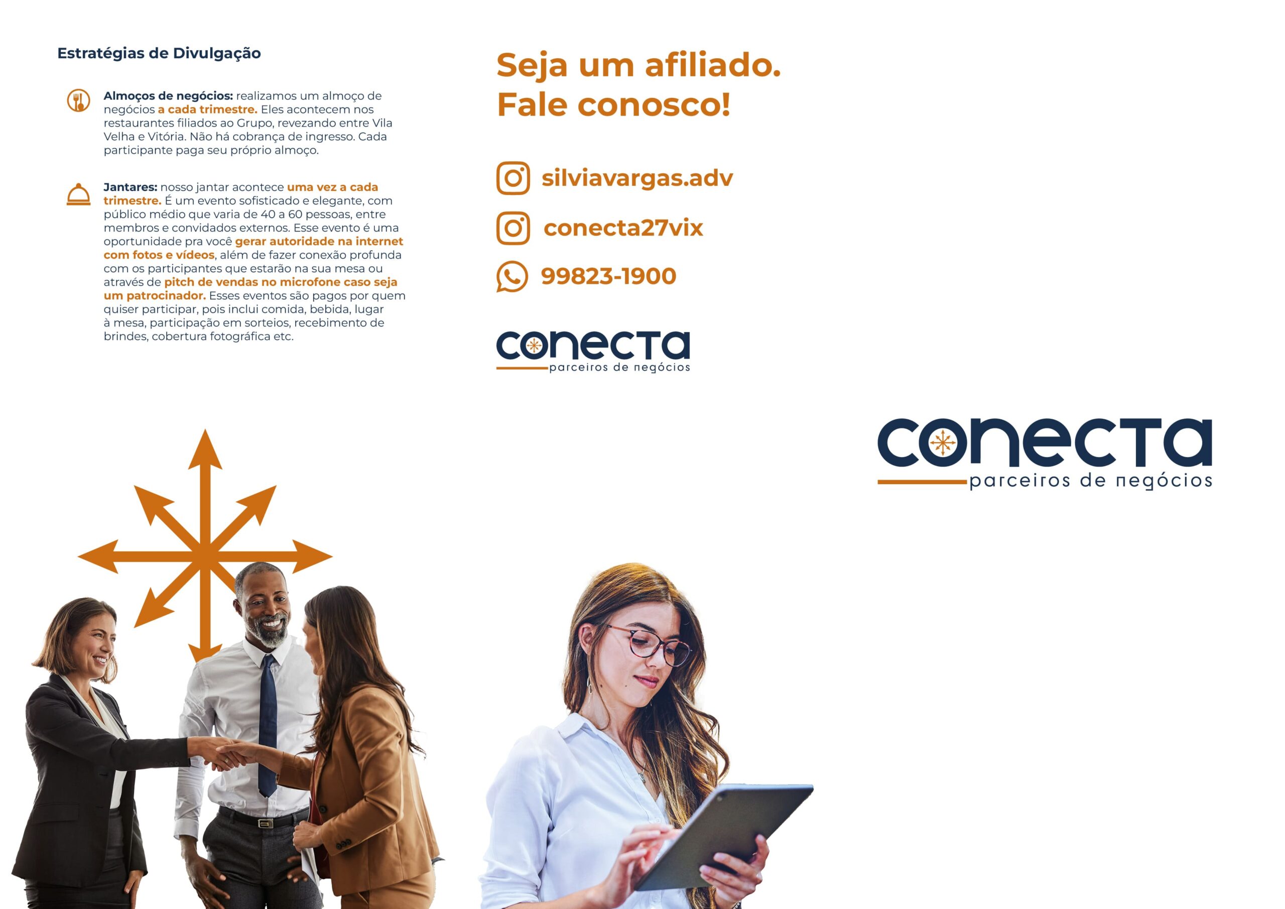
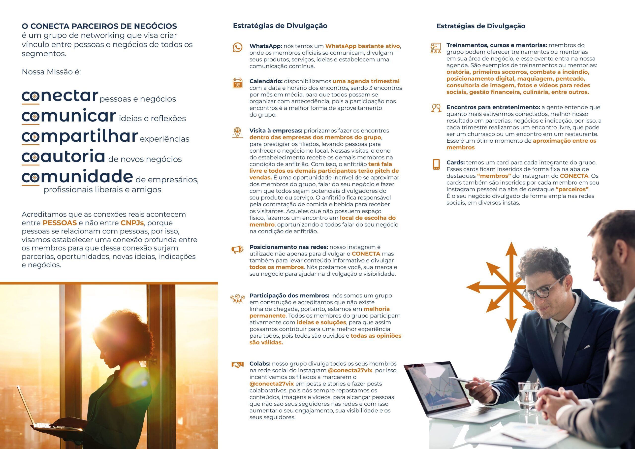
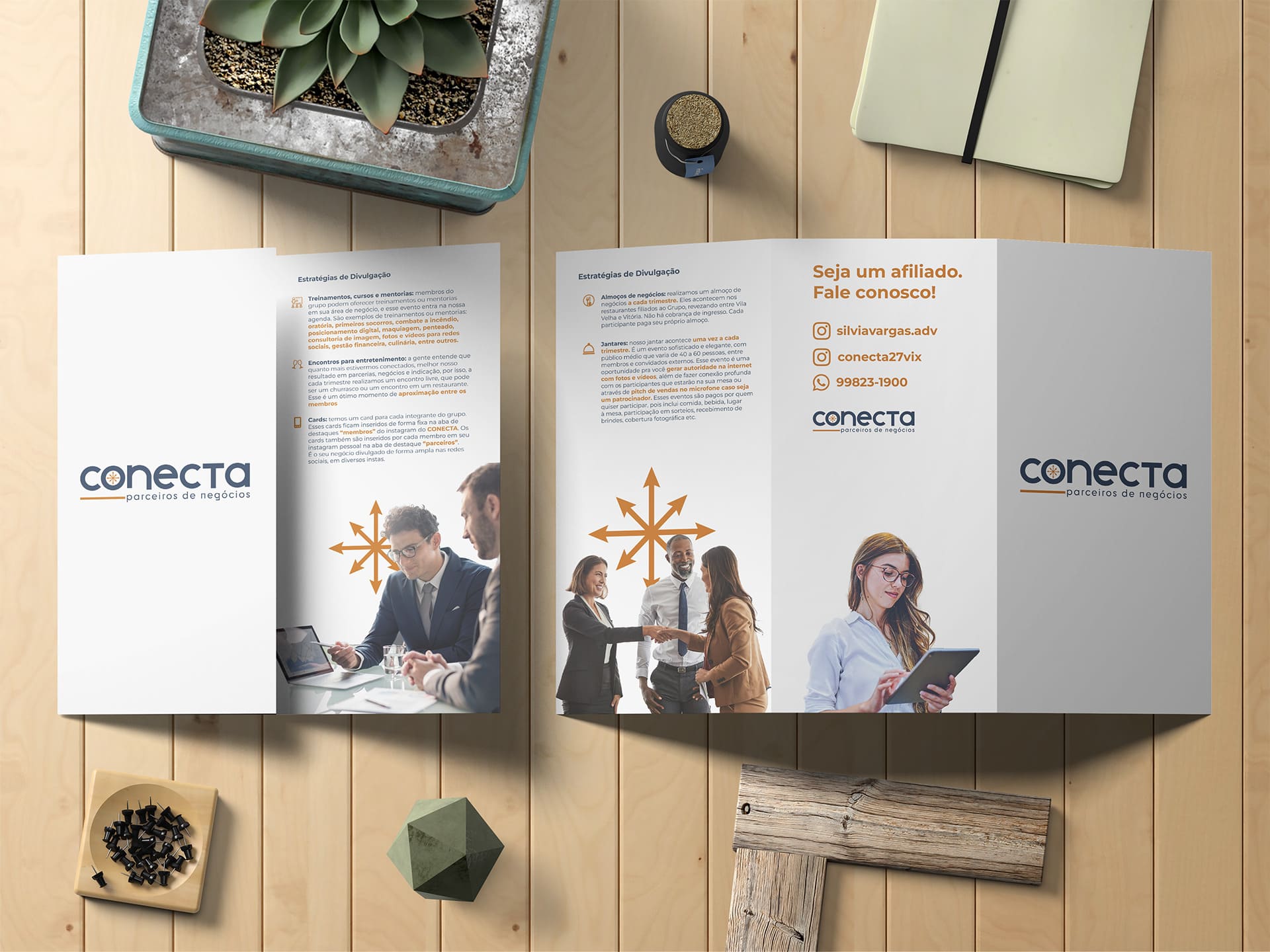
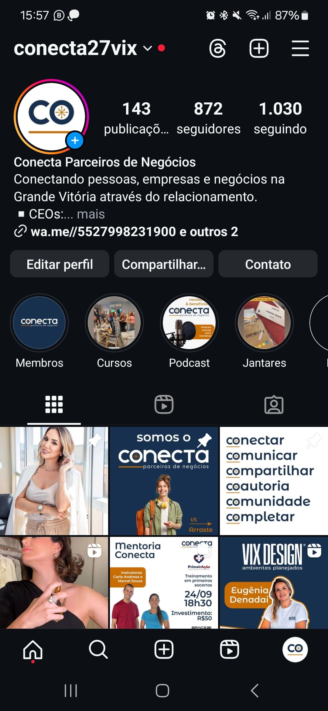
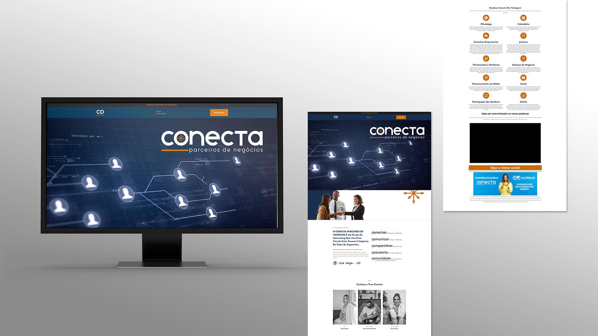
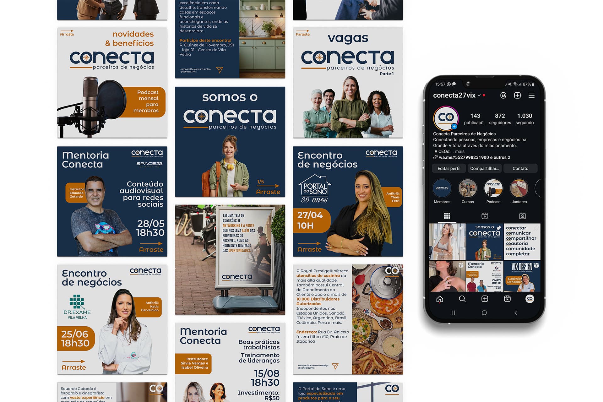
Applications: The identity was unfolded in a complete communication system, This included institutional stationery, a promotional flyer, a website and an identity for social networks (feed and stories), creating consistency and visual recognition across all channels.
The result is a brand lively and participatory, which represents Conecta as a network that guides, unites and drives - a symbolic compass for new businesses.
3.Results
-
Consolidated identity: The new brand has strengthened Conecta's image as a solid and inspiring community, This increases engagement between members and external recognition of the group.
-
Clarity of purpose: The symbolism of the compass and the consistent visual discourse helped to communicate your position clearly, The group has become a local benchmark in collaborative networking.
-
Social proof (feedback from members):
“The new identity translates what we are: a community on the move, made up of real exchanges and connections. Now we have a brand that lives up to what we represent together.”
- Silvia Vargas, Founding Partner Conecta Parceiros de Negócios
Deliverables
-
Logo and main symbol (compass concept)
-
Color palette and institutional typography
-
Printed materials: stationery and promotional flyer
-
Digital identity: website and Instagram templates
- Responsive website in WordPress